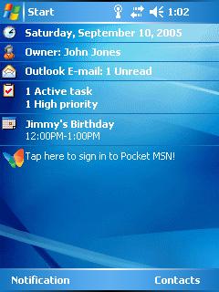
Front View with Information
Windows Mobile, formerly Windows CE, has surpassed the ailing Palm OS in the past year to become the number one mobile operating system. Although Windows CE’s original introduction was a bit shaky and initially failed to capture significant market share or user following (earning the nickname “wince”), Microsoft persevered and continued to refine Windows CE into what is now Windows Mobile 5.0. Today Dell and HP both ship their handhelds exclusively with Windows Mobile and plan to make Windows Mobile 5.0 the standard OS for their handhelds when it launches in October.
Windows Mobile 5.0 promises a number of upgrades and improvements over Windows Mobile 2003 and Windows Mobile 2003 Second Edition (SE). Excel Mobile and Word Mobile have received some improvements and a new program, PowerPoint Mobile, has been added into the mix. WM5 also sports a new push email system, similar to blackberry, and promises an improved networking stack.
The Basics
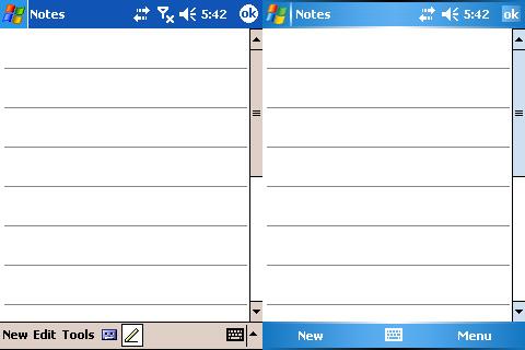
A number of changes have been made to the shell interface to improve the intuitiveness and usability of Windows Mobile. First and foremost, the menu bar has been overhauled as you can see in this side-by-side view showing Windows Mobile 2003 SE on the left and Windows Mobile 5.0 on the right:

Windows Mobile 2003 SE Side By Side With Windows Mobile 5.0
Perhaps the most obvious change is Microsoft’s newfound appreciation for the color blue. Windows Mobile 5.0 is very blue. It is a reasonably attractive effect. If for some reason you can’t stand the blue theme, there is an option to change it, although you may not be able to do so without downloading a third-party application.
Color aside; it is clear that the interface has been streamlined. Windows Mobile 2003 has a number of menu items and toolbar buttons, while the tablet input button is on the right-hand side. In Windows Mobile 5.0, the two menu items and two toolbar buttons have been reorganized into a single menu labeled, surprise, “Menu.” The tablet input button has been enlarged and placed in the center. Then on the left we are presented with the New note button.
Overall, the changes are a pleasant relief from 2003 SE’s perhaps aggressively complex interface. The clutter has been reduced while the overall contrast of the shell interface is now much higher (white on blue is much easier to read than black on gray).