|
Internet Explorer
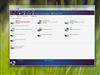
What can I say about the current version of Internet Explorer (IE) packaged with Vista? It makes me pine for the days of Netscape 3. It is ugly (the purple to blue to purple blend looks like a joke), it brings precious little to the table, and they've neutered your ability to customize it. The tabbed bar you see below is currently locked into position. You can add the classic toolbar (File, Edit, etc.) and a link toolbar, but you better be happy with them being below the tabs, because that is your only choice. Maybe it is just my Firefox usage, but it seems a lot more intuitive to have the tab bar on the bottom of the stack.
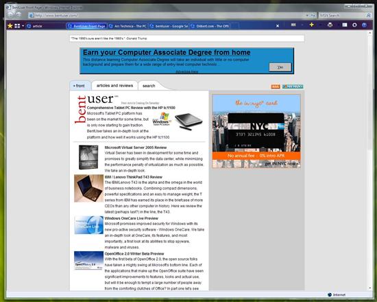
IE7 on Vista: Less features more ugly
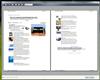
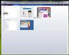
Microsoft did add a couple of new features that people might find useful. First of all, they beefed up their printing capabilities a bit. You can preview more than two pages at once, minor, and it defaults to printing just what you have selection (if anything, otherwise it defaults to the whole page). Wait, I guess they really did not do much here, wonder what Paul was raving about? There is another feature though that is at least novel. Now that IE has embraced tabbed browsing, they've put a little thought into it and come up with a multi-tab view. Works well, kinda like Expose (Mac OS X windowing feature, ed.) for your web browser. Check it out below.
File Browsing
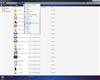
Microsoft has performed some serious interface surgery on the file browser / Windows Explorer. As you can see in the screen shots, the classic File Edit View etc bar is gone, replaced with a context sensitive bar. In theory this is more intuitive to use, unless of course you've used the old system since Windows 3.1 - then it is rather jarring. The look has been changed in many more superficial ways as well. Even the folder icon has changed.
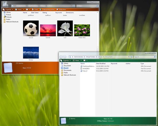
Virtual foldars for pictures and documents
Microsoft has also added the concept of virtual folders to windows. First seen in a large scale on Apple's OS X Tiger, these are essentially saved searches that refresh each time you open them. Since indexed search is a big part of Windows Vista, it can do this relatively transparently. Microsoft ships Vista with a bunch of virtual folders including one for recent files, one for all documents, and one for all media files. Seems like it should be a good tool for keeping our digital lives a bit more organized.
|
|