Window Switcher and other Window Management Features
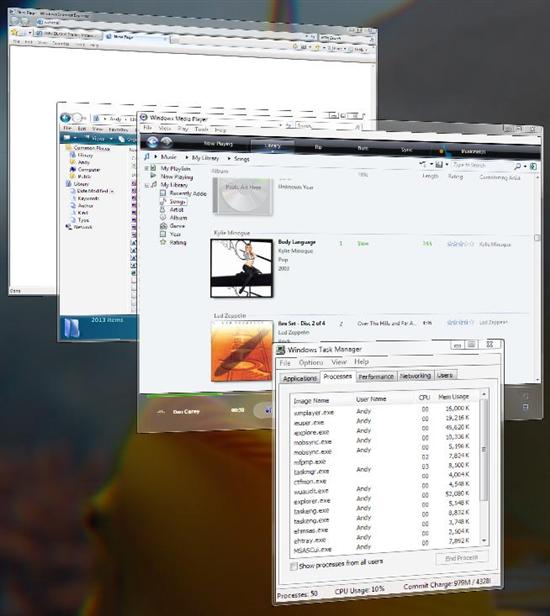
Alt-tab is still alive and well in Vista, but Microsoft has augmented this with the Window Switcher - which may end up having its own hardware button, similar to the Windows key. Window Switcher is similar in purpose to Exposé from Mac OS X - it is a way of visualizing all of your open windows and quickly finding the one you want.
Task Switch
When you press the Window Switcher button in the quick launch tray, you are presented with a 3D edge-on view of all of the open windows. The technology behind this is interesting. Because of the Windows Presentation Foundation (WPF), all open Windows are now essentially vector objects. This makes a slick presentation like this possible. For example, let's say you're watching a video in Windows Media Player and then hit Window Switcher - the 3D view of WMP will actually continue to play the video, and any flash animations in your browser windows will also continue to play.
Another interesting result of WPF is that windows no longer need to repaint when another window is dragged over from them. You may have noticed in Windows XP, and other operating systems, that when you drag one window over another, the lower window will repaint itself for every pixel of movement of the foreground window. This is basically a holdover of 2D window rendering technology. Mac OS X (har har) was actually first in getting rid of this when they moved to 3D hardware accelerated windows. WPF is arriving a little later but is also a more sophisticated system. But I digress.
Once you open the Window Switcher, the scroll wheel is used to flip through all of the open windows. After using it a bit, it does appear to be useful and the slick factor is always welcome. Another example of WPF in action is the window previews feature of the taskbar. When you move the mouse over a taskbar button, a small live preview image tooltip will appear above it like so:
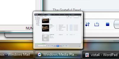
Preview Tooltips
This feature is decidedly useful.
One final note, we had hoped to show screenshots of WPF-enabled applications, however various technical issues in 5270 appear to be preventing us from running most WPF applications. We will definitely deliver in this area for Beta 2, as the WPF framework has a lot of potential to revolutionize the way Windows applications look and feel.
My Computer
My Computer has been renamed Computer and looks like this:
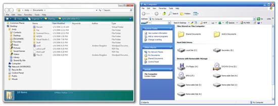
My Computer
In general, My Computer and Windows Explorer have undergone a number of changes. Firstly, the familiar task lists have been dropped in favor of a horizontal green toolbar. For example, "Change or remove a program" is now listed as a toolbar button in Computer.
The folder hierarchy has also been replaced with a semi-static list of items, such as Common Places and Network. In a more cosmetic change, the familiar menus have been ditched by default (you can turn them back on) and the forward/back buttons and address/search bar has replaced the menu bar at the top.
The address bar also now takes the form of a breadcrumb bar which allows you to perform lateral navigation, like so:
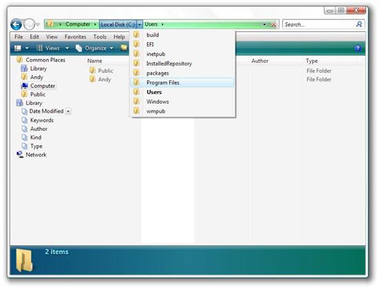
Breadcrumb Bar
This is kind of an interesting feature. I have not really gotten used to it, but it certainly has the potential to be slick - freeing you from up/down, forward/back navigation.
Also available now is an omnipresent search box - available even in Open and Save dialog boxes. This produces As-You-Type search functionality very similar to the new start menu.
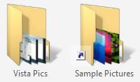
Another interesting feature is look-inside folders, similar to what folders look like in thumbnail view in XP:
Look Inside

